Unless you are teaching under a rock, you know that data collection and data analysis is a driving force in education these days. Administrators are asking for data and numbers and charts to document the learning going on in classrooms. I’ve tried to be open-minded about this, and I have been working hard at figuring out what kinds of data collection might be useful for me as a teacher. Last year, I began documenting the writing assessments of my students as a whole to see if our work around open response, in particular, was making a difference in the content and quality of their writing.
This year, in September, after assessing an open response piece of writing (based on a Reading Response rubric that is tied to our district’s Standard-based Reporting system), I began to create a visual graph of where they were as a class. Last week, I assessed another writing sample with the same rubric, and again, created a graph. What I was wondering was: have they made growth since September? (This is all tied to some goals in our Communities of Practice/PLC work, too)
Clearly, they have.
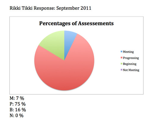
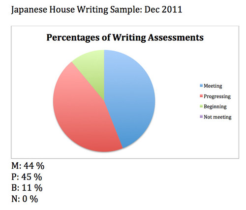
Notice how there has been a nice shift from the “Progressing towards grade level expectations” to the “Meeting grade level expectations.” There is a still a much-too-large percentage in the “Beginning to show grade level expectations” category, and those are the specific students I need to keep targeting with one-on-one intervention. These kinds of informational data graphs, while fairly simple to construct, are valuable in giving an overview of growth.
Now maybe I see what those administrators are talking about.
Peace (in the data),
Kevin