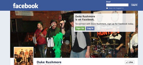
I’ve had Facebook on my mind for a few days now, I’m sad to say. It began with some incidents with my students at school, but then shifted when my band –Duke Rushmore – launched our own site on the social network as a way to let friends and fans (!) know when and where we are playing in the coming months. Another bandmate is in charge of our FB page (I am the webmaster of our Duke Rushmore website). And then, the other day, I was working on our Western Massachusetts Writing Project Facebook site, too.
You should know that I am no fan of Facebook for a variety of reasons (mostly on privacy issues). Now, after spending more time there, I am even less of a fan. Is there anyone at Facebook who knows a thing about design or what? I have come away with the feeling that Facebook has to be one of the ugliest sites on the Internet (I know this isn’t true but …) and is slowly coming to resemble MySpace with its ads, and its clutter, and more (and may very well someday hit the trash heap like MySpace.)
Given the huge cash flow at the company, why aren’t they investing in some designers? I look at a typical FB page and find it difficult to navigate, get quickly tired of that standard blue, and my eyes don’t know where to even begin to focus to find what I want to find. It’s a mess. This year, I have been teaching a lot about design principles with my sixth graders and it seems to me that if they were in charge, they would come up with something cleaner and easier to use/read than what Zuckerberg and company have put out there for the world.
Why don’t people revolt? Seriously. Why, in this day and age, don’t people demand excellence in design when it comes to the web? It’s not like good design is difficult to do. (OK, so people don’t revolt because FB has momentum, and now comfort, and people will put with bad design for ease of use.)
What I realize is that Facebook knows all of this (of course they do) but doesn’t give a damn. They see the money flowing and why change a thing (the timeline design? ugly. The new banner picture? very ugly. Horrible, in fact) when millions of people are content to write their lives onto an ugly page that is difficult to manage (I am still trying to figure out how to make our WMWP Facebook page public to the world outside of Facebook. I spent a lot of time yesterday trying … and failing, and thinking, what the heck … this should be easy).
I won’t argue with my band against Facebook, either. It still is a way to get folks to follow us to our shows. But I don’t have to like it.
Peace (with good design),
Kevin
There are some plugins for Safari (and I’m sure Firefox) that I haven’t used that make the interface cleaner and/or simpler. These wouldn’t be of use to you as someone who doesn’t use Facebook but it might improve on what is a problem for you.
Thanks Matt. I guess I would hope that we would not need a third party for such a thing as design.
I should know better, right?
I know, I hate the new format!! I am in hell at a workshop on long term English Learners, lots of surface info, nothing concrete, missed opportunity. all except for Dr. Doug Fisher who in 30 minutes gave more real world advice than any other speaker on the site!!
As for Facebook, you can go to the old format I think which made more sense in my opinon.
FAKEbook is ugly and generic looking and I have been saying it for YEARS. Everyone tried to get me to make an account but I have refused for the simple fact that it is so unattractive looking. My gosh! At least give us the option to customize the blue to a different color! Like you said, it is hard to navigate especially since they keep changing it all the time.
I personally use twitter. It is simpler and you can make it look the way you want. I just wish my friends would use twitter too. They are zombies stuck in Facebooger land.