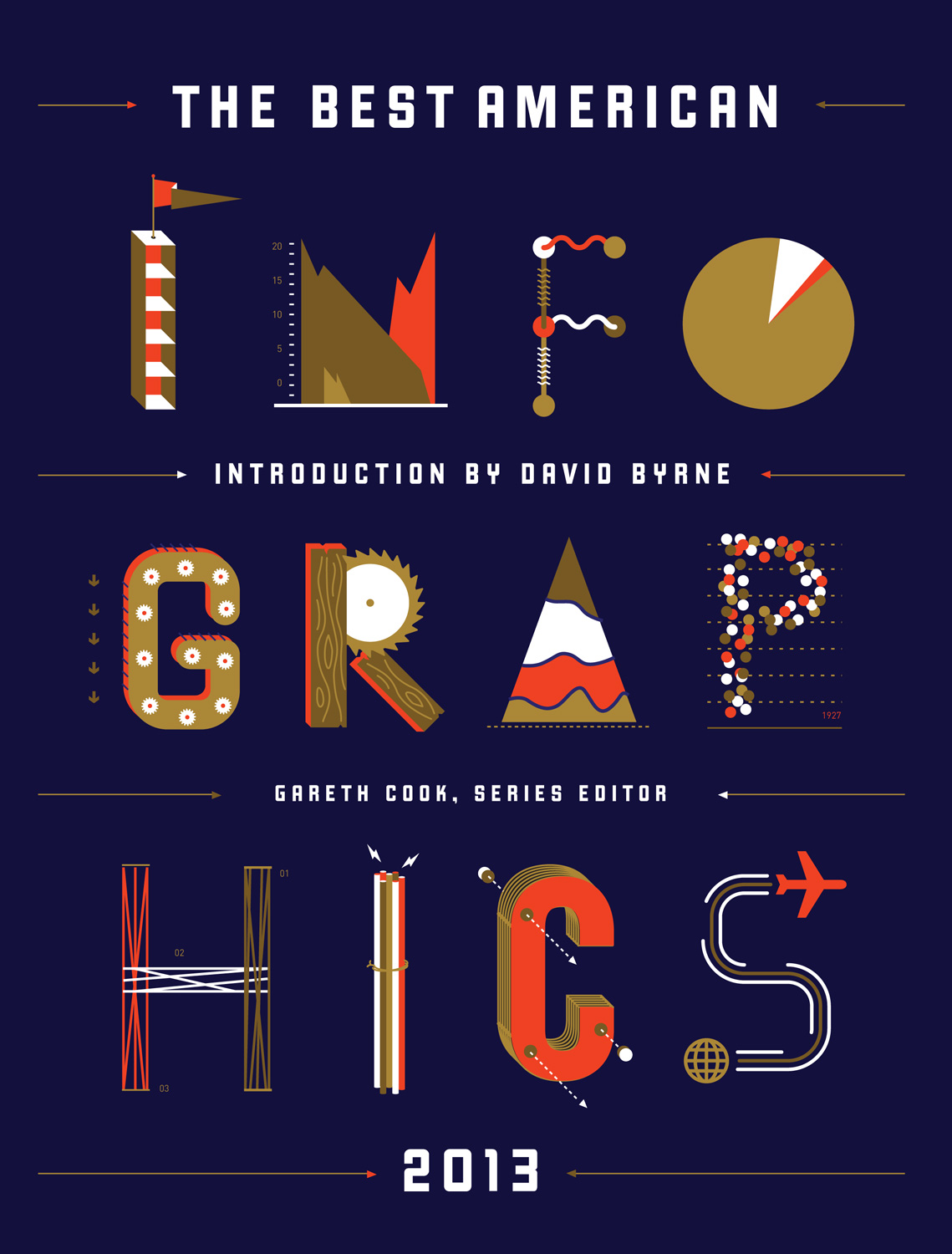
Wow. I was completely absorbed and blown away by this new collection of infographics from the “Best American” series. With an insightful foreword by editor Gareth Cook (whose name I recognize from the Boston Globe) and an introduction by David Byrne (he, of Talking Heads fame and beyond), the collection of visual stories told with data as infographic is a deep dive into new ways to think not just about reading, but also about writing and expressing ideas.
“We now find ourselves in a golden age for information graphics,” Cook writes, but then he also explains the long history of using graphics to relay information, pulling out a census map from the Civil War that documenting populations of slavery in each state of the United States — a map that Lincoln kept handy and referred to often.
The Best American Infographics 2013 is chock full of amazing information (including the glimpse at that map), and yet both Cook and Byrne remind us that data gets tilted when brought to view in the visual. What the artist leaves out, and how they portray the data, and which lens is deemed most important, all work in the mix of telling the stories. I’m connecting those ideas in my head to work we do in our classrooms around argument and persuasion, and the need to pull more visual information into our stories and essays and writing.
Here, with infographics ranging from “Feelings that Cannot be Expressed in English” to “A Better Food Label” to “Who Reads Erotica” to “Where Twisters Touch Down” to “American Education Gets a Grade,” this collection touches on a wide range of topics, grouped around the concept of You, Us, the Material World and Interactive Infographics. I encourage you to check out the online links to the interactive infographics. You’ll be blown away by the real-time carbon animation, Bear 71 (you can even put yourself in that one), and the wind chart …. it’s all just stunning.
I also enjoyed, as I always do, the vignettes of the artists and number crunchers explaining where the data came from, what the intentions were, and the artistic choices they made when creating each infographic. Those kinds of reflections are valuable not just in understanding what someone else has made (and it is), but also to begin the shift towards the idea of: How do I best build my own infographics of value?
This is a book I am going to return to, and hope that the series continues next year.
Peace (in the data),
Kevin
I have been looking at what some have termed ‘quant overshoot’. Here are two links to very evocative ideas about what I consider a capital “T” truth in my pantheon–experts on tap not on top.
Post: http://steveradick.com/2014/01/06/you-become-what-you-measure/
PDF: Article is called “Numbed by Numbers: Why Quants Don’t Know Everything” –dropbox link: https://www.dropbox.com/s/qwd2vi4zv0xfyh7/Wired_USA_January_2014%20copy.pdf (Let me know if you have trouble with link.)