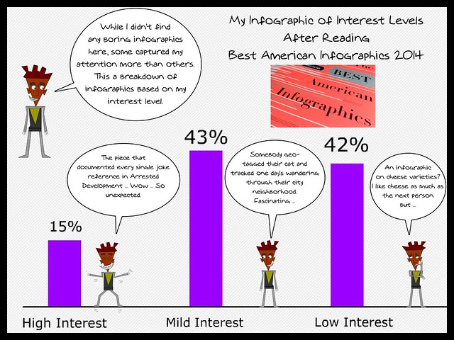
I thought I would use the theme of Infographics to review a book about Infographics. The book is the second year of the Best American Infographics and like last year’s version, it is a wonderful read, chock full of amazing data representations. My infographic shows my interest level in the various articles in the collection. Not every scientific, I guess, but a good overview of what I thought as I was reading the collection (edited by Gareth Cook, with an introduction by Nate Silver).
What I like most is how surprised I am by some of the pieces, from the one where someone geotagged their cat as it wandered through their city block all day; to the way that a baseball looks for the batter, depending on the kind of pitch; to a map of every single reference to every single joke in the first seasons of Arrested Development; to the evolution of email in our lives; to the migration of birds and how the numbers are dropping; to whether a tweet was written by a human or twitter-bot. There are just too many cool infographics to even mention here.
But I did want to mention that the interactive infographics are online for perusing (Check out the drone attack/casualty chart … it will break your heart and open your eyes to the faraway battlefields).
I am also very curious about the free Map Stack tool that has been made available for anyone to use. It gets a whole page in the book, and the group that developed it got funding to give Map Stack away to journalists and others, to create data-centered mapping projects. I have no idea how to use it or why, but it seems worth the time to consider.
Peace (in the info),
Kevin
hahaha, using an infographic to review infographics, you made my ‘meta’ today.
captcha=get giver