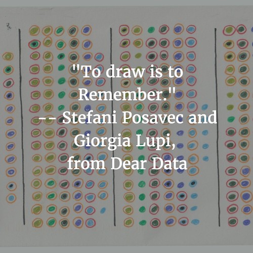
Infographics done right fascinate me, particularly if they tell a story from the data. Cold data analysis … does nothing for me. In the amazing book Dear Data, graphic designers Stefanie Posavec and Giorgia Lupi document a year of postcards between themselves, sharing personal data in hand-drawn styles. Their 52-week journey of documenting and share is a reminder of how we might be able to uncover insights into ourselves, and each other, by paying more attention.
In fact, over at the Connected Learning MOOC community, a number of us are using Dear Data as a launching and inspirational point for sharing Data Postcards in the coming year. Some of us sent out Resolution Data postcards in January and “love” is the theme of February, and we are using Lupi and Posavec’s work as our starting point, to some degree.
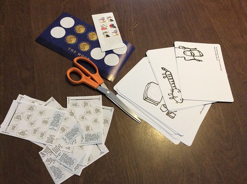
This is my workspace the other day, as I was working on my data postcards, which I sent to different parts of the world. I sort of cheated by not doing every one by hand, but this is how I got it to work for me.
The two developed weekly themes that they built their data collection on, from the opening theme of “clocks” to observing urban animals (week 34) to a week of distractions (week 44) to a week of goodbyes (week 52, of course). Along with sharing the postcards, the two write about their experiences, from the difficulties of coming up with data representations to the celebration of sharing to insights they gained about their personal worlds through such an endeavor.
I also appreciated the insights at the end of the book, where the two outline some suggestions for others, such as:
- See the world as a data collector
- Begin with a question
- Gather and spend time with your data
- Organize and categorize it
- Find the main story that the data tells
- Share the data and the story
We don’t need to leave it to our machines and our computers and vast programming ventures to gather our world. We can do it ourselves. Lupi and Posavec show us the power of connections between people, and how to humanize the data, as a means to strengthen insights and understanding through a very visual means.
What’s your data?
Peace (it’s not just numbers),
Kevin

