Not Even Remotely Visibly True: More Distorted Graphs

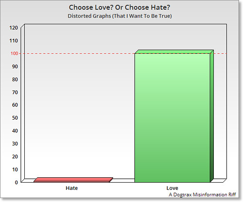
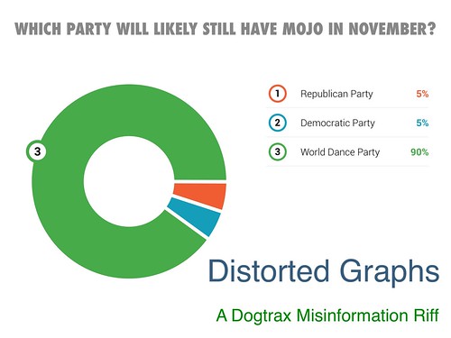
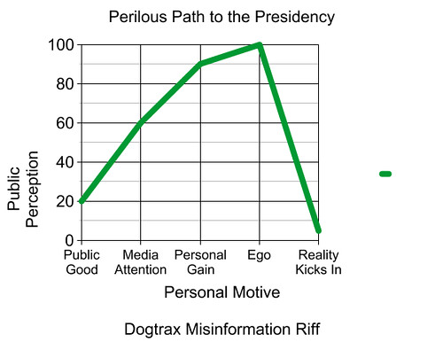
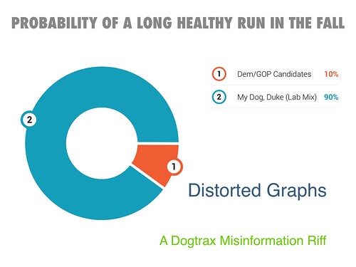
I’ve spent the last week or so making another push to create a series of Distorted Graphs as a way to engage with the politics of the US Presidential Campaign. What I am doing is creating graphs and charts that look sort of real, but which have no data underneath. I am making it all up.

Why?

Mostly, I am seeing how I can use visual misinformation (which I clearly label on all of the graphs) to make a political and satirical point about the state of politics. I am also curious to see how something sort of polished might appear to be true, and how to remember not to trust my eyes with charts and graphs and polls and such. Although I try to poke at both sides, I don’t try to be “fair and balanced” with it.

But I am having fun. So there.

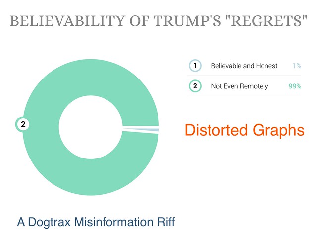
This round (done entirely in Haiku Deck and exported out as image files) began with an interview Donald Trump did about his “regrets” over some of his comments. Who really believed that? Seriously.

Distorted Graphs

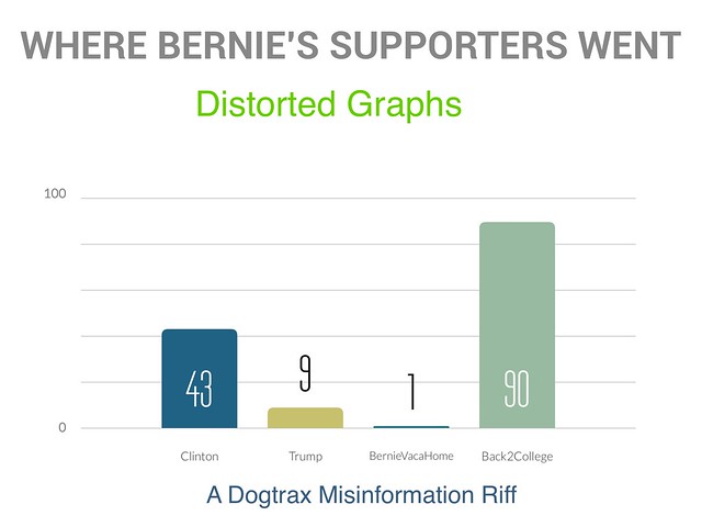
I was wondering where Bernie’s folks have probably gone. Then I saw the news that he bought a $750,00o summer home, and the word “hypocrite” started to flow from my GOP friends. Would Bernie be inviting all those young people to his $750,000 home for a little summer break? I doubt it.

Distorted Graphs

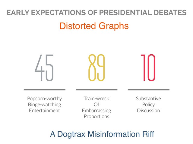
The presidential debates are coming soon. Will they tackle important issues? Or will the idea of wondering what Trump will say trump anything of substance?

Distorted Graphs

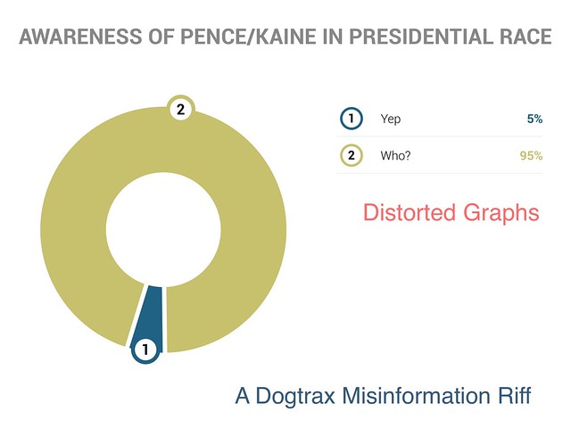
I had a strange moment when I could not, for the life of me, remember who Clinton’s vice presidential running mate was. Really. Then I thought, it can’t be just me. (Note: his name came back to me not long after I forgot it. I didn’t Google it.)

Distorted Graphs

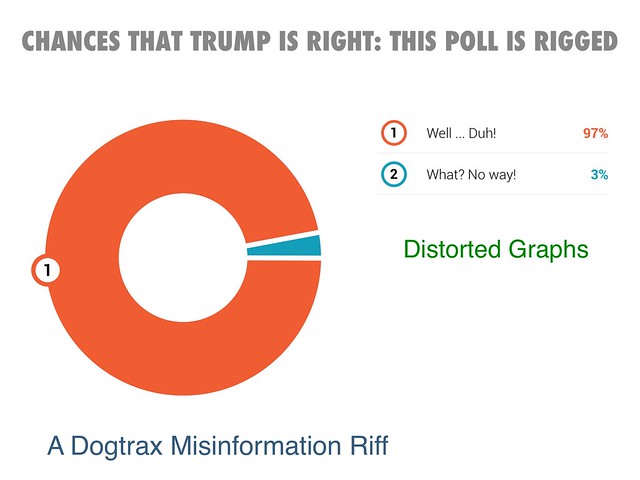
All of Trump’s rhetoric over “rigged elections” and “rigged polls” had me looking at my own Distorted Graphs. Rigged? Well, yeah.

Distorted Graphs

The Clinton Foundation is still a headline. I wondered if there was talk about changing its name. The “staff” referenced here is rather nebulous — did I mean I secretly polled the staff of the Clinton Foundation or my staff here at Distorted Graphs? (Hint: One of those organizations has more than one person. The other does not.)

Distorted Graphs

Just the idea of Trump flipping and flopping, and then getting heat from his own party and supports for it, is worth a graph.

Distorted Graphs

The most ridiculous stories in this latest news cycle, I think, has been one questioning Clinton’s health. One can’t help but hear Monty Python in the head (“I’m Not Dead Yet”) as this foolishness goes on.

Distorted Graphs

Peace (we always tilt towards it),
Kevin

PS — here is the entire collection of Distorted Graphs, which began in the Primary Season

Choose Love

I so appreciated that John Spencer shared out this video message to his young son in the wake of the recent Orlando tragedy. It’s message of “love” should resonate with all of us. Should, but may not. I created this Distorted Graph, tilting us all towards love.

Distorted Graph Choose Love

Peace (everywhere),
Kevin

Data? Who Needs Data? I’ve Got Graphs!

Distorted Graphs: Where's the Party At?

So, I have been having more fun that I have a right to have by making political-themed distorted graphs that have no data correlation whatsoever. I don’t even think or consider any numbers when making these. Who cares about data when you have cool graphs in a misinformation campaign!

Distorted Graph: Path to the Presidency

Actually, along a serious line of thinking, the making of Distorted Graphs (which was inspired by a Make Idea via the Letters to the President 2.0 project hosted by National Writing Project and Educator Innovator) has forced to think very visual when trying to make a satirical political point.

Distorted Graph: Healthy Run

I usually have a general topic in mind when I begin these, and then the decision becomes, what kind of graph format? Do I need a pie chart or a line chart or a something else. What visual will complement the satirical?

Distorted Graphs: Bottom Lines

I’ve been using a combination of apps to create the charts , including the chart creator built into Haiku Deck. It’s pretty, if limited. But limiting myself has been fine because it forces me to consider the content and message.

Distorted Graphs Biased News

I’ve shared some of these into the Letters to the President Twitter stream, but I have wondered, is that hashtag for students? I see some in there. What are they thinking of this Dogtrax dude, setting forth fake graphs? I hope they make their own. I was inspired by some of their real, true graphs. And I’ve been sensitive to my audience, however, and have avoided any profanity. When it comes to this presidential race, that has not been as easy as it seems.

Distorted Graphs: Talk about Education

I’ll make more as I get inspired, and share them out when I can. For now, just know that these Distorted Graphs represent the whole Distorted Political Spectrum, and like memes, offer another way to engage in discourse on the way the presidential campaign is unfolding before our eyes.

Peace (it’s off the charts),
Kevin