Bill Moyers and the Digital Divide

Bill Moyers takes on what is contributing to the Digital Divide, looking at corporations that don’t care enough about many communities (rural, urban) to provide high-speed connections. Simply put: the profit isn’t there and companies are built for profit. But what is that unequal access mean for our students and then future? And shouldn’t our government be doing more on this?
Here is just one clip:

from the show’s promo:

“America has a wide digital divide — high-speed Internet access is available only to those who can afford it, at prices much higher and speeds much slower in the U.S. than they are around the world.

But neither has to be the case, says Susan Crawford, former special assistant to President Obama for science, technology and innovation, and author of Captive Audience: The Telecom Industry and Monopoly Power in the New Gilded Age. Crawford joins Bill to discuss how our government has allowed a few powerful media conglomerates to put profit ahead of the public interest — rigging the rules, raising prices, and stifling competition. As a result, Crawford says, all of us are at the mercy of the biggest business monopoly since Standard Oil in the first Gilded Age a hundred years ago.

“The rich are getting gouged, the poor are very often left out, and this means that we’re creating, yet again, two Americas, and deepening inequality through this communications inequality,” Crawford tells Bill.

– from http://billmoyers.com/episode/full-show-who%E2%80%99s-widening-america%E2%80%99s-digital-divide/

These are issues we need to pay attention to.

Peace (in the equity),
Kevin
 

Student State of Technology 2013: Facebook, Instagram and More

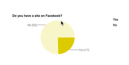
Yesterday, I began sharing out some data that I collected from my sixth grade students about their use and perceptions of technology in their lives as we lead up to Digital Learning Day on Wednesday. Today, I want to share out the data from questions about social networking, but in particular, about my students’ use of Facebook and Instagram. I should note that my kids are 11 and 12 years old — not officially old enough for Facebook and Instgram (as if Zuckerberg and company really care).

My observations?

  • The percentage of my students who are on Facebook seems to have dropped this year, from last. I don’t know if an informational email that I sent earlier this year to all parents with information about Facebook (age levels, advice on how to monitor traffic, controlling privacy settings, etc.) had any impact but I am glad that the numbers are not growing.
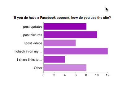
  • It’s clear that my students view social networking spaces for the value of connections among friends more than sharing of information. But still …a fair number on FB are sharing images and videos, and probably not at all considering the privacy ramifications, nor their digital footprints (that will be our topic next week).
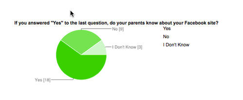
  • I notice a few students are using Facebook without parent knowledge. That always concerns me. I know, from experience, how hard it is to keep track of what our children are doing. But it is critical.
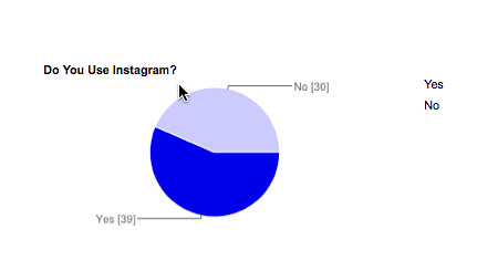
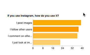
  • More than half the class is on Instagram now, which means they are probably sharing a lot of photos. This app will be a main focus next week, I think, as we talk about privacy issues. I also know that they probably have access to a lot of inappropriate content in those spaces (thus, the age 13 level).

On Facebook
State of Tech 2013 facebook account

Use of Facebook
State of Tech 2013 Facebook use

Parents Know About Facebook Use
State of Tech 2013 facebook parents knowledge

On Instagram
State of Tech 2013 Instagram use

How Using Instagram
State of Tech 2013 Instragram use
Peace (in the social sharing),
Kevin

Student State of Technology 2013: Tech Useage and Perceptions

Each year, I have my sixth graders take a survey we call The State of Technology. The data I collect over a series of questions forms the basis for discussions (we will have next week) around digital citizenship and privacy and footprints. Plus, I find it fascinating to get a glimpse into what they do with technology and how they perceive it. I’ll share out more elements in the coming days, but these questions ask about amount of time on tech and what they do, as well as their impressions of themselves as tech savvy kids.

What observations can I make?

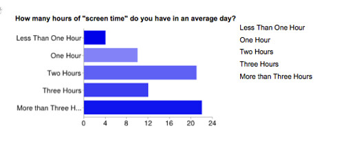
  • First of all, notice the amount of time they spend with technology. Hours and hours each day. That’s a bit frightening, and it is something we grapple with in our home, too, with our children. I continually return to the questions as a teacher of the amount of screen time I am bringing into my instruction.
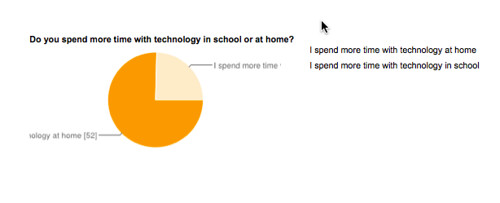
  • Mostly, they are using the technology at home and not in school. No surprise there, I suppose, given the proliferation of devices now available.
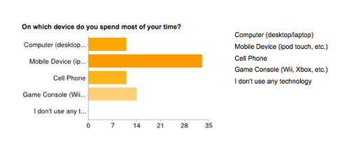
  • The shift to mobile devices over desktops and computers is clearly evident, and this has grown by leaps and bounds each year (reflecting society, I suppose). In fact, each time I introduce some technology in class, the first question is always: is there an app for this? (We had this yesterday, as we worked with Glogster for the first time)
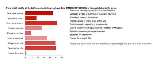
  • It’s also interesting that text messaging is still an extremeley popular use of technology, but playing in online gaming environments has grown considerably in the past year, and watching videos online is a steady growth pattern over previous years.  What I would love to see is more growth in the categories around making, creating, producing … instead of the ones around watching, experiencing, staring.
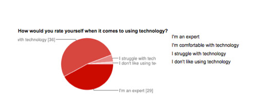
  • Finally, the question about self-perceptions shows another shift in my students. Not long ago, I would have had a whole group identifying themselves in the “uncomfortable” category, but now, the vast majority either feel comfortable with whatever device or platform we put in front of them, they also consider themselves “experts.” (Reality check: they still need guidance and help to see the larger picture of how things work, and why.) And when they think about their own use in comparison to their parents, well, kids always know best, right? Here, they clearly think they are more knowledgeable and savvy than mom and dad.

Amount of Time
State of Tech 2013 hours of tech

Where Time is Spent
State of Tech 2013 time on device

What They Do on Tech
State of Tech 2013 outside of school

Home vs. School
State of Tech 2013 Home vs School
Self-perceptions of Tech Use
State of Tech 2013 rate self
Compared to Parents
State of Tech 2013 compare to parents
In the next few days, I will share out their use of social networking spaces

Peace (in the data to understand),
Kevin

PS — Want a copy of the survey to use with your students? I think I created a blank template in Google Drive that I can share here with you. Feel free to use it as you see fit.


Source Evaluation: NoodleTools Show Me

I saw this site from a tweet from Troy Hicks and I like it. This site — Noodletools Show Me — is a way of providing scaffolding to evaluate books, websites, and more through simple strategies. It’s another entry into information literacy strategies (which is a key part of the Common Core). The site is divided into three categories, so you can tailor it to the level of your students. I liked the “junior” level, as it connects a lot with some of our work around evaluation of sources. (I also note that these free tools are connected to a paid service. I am hopeful the top layer of options remains free, but you never know).


Peace (in the share),
Kevin


Struggling to Write with 10,000 Words

Have you heard for the Up-Goer Text Editor? It is an online tool that was inspired by an XKCD comic that explained space travel in a comic with writing from the 10,000 common words list. Now, you may think: so what? 10,000 words is a lot of words. What’s the rub? Actually, 10,000 words is not a lot of words, particularly when you are dealing only with common words, and it is quite difficult to explain a complex idea (like space travel) in that way. I guess someone was inspired by that comic and created the Up-Goer Text Editor, which provides you with a box to write in and alerts you when you have slipped the bounds of the 10,000 words. It’s pretty interesting.

Check out how I did:

And this is what it looked like when I corrected it:

How did you do? Give it a try.

Peace (in the words),
Kevin

PS — thanks to Doug Belshaw for sharing this site in his most recent newsletter.

I Write …. (on HaikuDeck)

Haiku Deck is the best application for creating presentations on iPad

I’ve been playing around with HaikuDeck on our iPad. It’s a presentation software, so it works like Powerpoint or Keynote. The difference is the “feel” of the app (it is only available on iPads, I believe). It’s very design-conscious, and works best with short text superimposed over beautiful pictures. The app searches Creative Commons for images that you can use (or you can upload your own). I need to play around with it some more, but I like the way it works.

I decided to explore the question of “why I write” with images and simple text.

Peace (in why I write),
Kevin


Gooru: Another Research Project Resource

gooru
It’s been some time since I checked out Gooru, and boy, it sure has grown since. I went back to the site, which is a sort of filtered/collected search engine space, this morning because I know my National Writing Project friend, Paul Allison, is going to be talking about Gooru tonight on the Teachers Teaching Teachers webcast.

This is what Paul sent out, in case you can join him. (I am going to try …)

How do you teach with Gooru? We’ll be talking with teachers who use Gooru in their classrooms and want to connect and collaborate with other teachers. Hear from Gooru power users, share best practices, exchange ideas, and tell the Gooru team what we can do to improve Gooru for you.


Check out Gooru through the lens of this analysis of OER Project Blue Sky: Big Boost to OER From . . . Pearson?

We’ll be joined by @jackcwest @gooruteacher  Xenia Shiah: http://www.linkedin.com/in/xshih , Jody Donovan, @leahousdIT and YOU!
Join us at edtechtalk.com/ttt at 9PM ET/6PM PT/World Times: goo.gl/5Vr8M on Wednesday 1.16.13

So, this morning, I went to Gooru to poke around a bit and remember what it is about. When I had been there last, the site had recently launched and I wasn’t quite sure what they were up to. There didn’t seem to be a lot of content. Now I understand. The site is another way to help students streamline their research queries (sort of like Instagrok, which I use) and for teachers to build up “collections” of resources that can be shared. I like the overall feel of the site — it takes a few minutes to get a sense of what to do, but once you understand it, you will see there are powerful paths to follow.

First, there is the basic search, which breaks down queries into categories, such as video, lesson plans, resources, etc. And along with peeking at the collections of other teachers, you can begin to create your own, too. (I started building one about Civil Rights, and then added in some collections of other teachers who had already been doing some of the same work, so that I did not have to do it all over again). There are places to add interactive quizzes, study areas for math and science and social studies (they note that ELA is on the way) and … more stuff that I had time to play with.

In the end, I think Gooru is another interesting research tool that can help students find information they need, in a meaningful way, and might allow teachers another opportunity to teach web-based search for projects. My history colleague is teaching Cuneiform writing right now, and so I did a search on the site for him, and what came up would be very valuable for his work with students, I think. Same thing for my science colleague, who is teaching volcanoes and has students doing some basic research right now. (In fact, we had a discussion at lunch about how so many of our students don’t have the basic search skills — even though I did a whole unit around it with them at the start of the year! Ah.)

Peace (in the share),
Kevin


Creating the Infographic: Nuts and Bolts


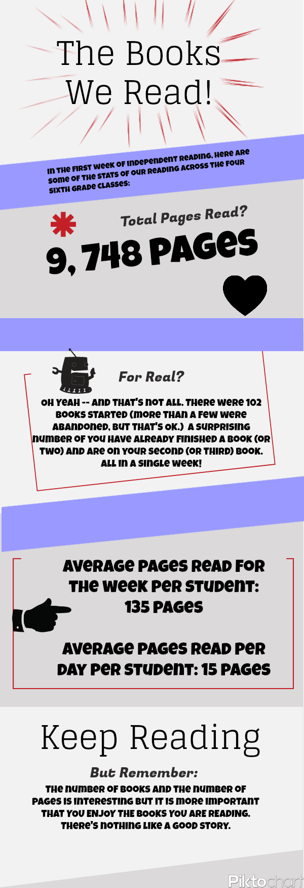
Yesterday, I shared out the infographic that I created using data from my students’ reading journals on how many pages they had read in the first week of our independent reading. It was really a way to capture the overall reading, excite them into thinking about data and books, and (for me) a way try out infographic creation. A few folks have asked how I went about doing it.

First, of course, I needed data. I had thought of using a massive chart in the room, having students track page each day. But that seemed cumbersome, and maybe a bit too distracting. So, instead, on the day I was collecting their reading journals for review, I had them write down the number of pages that they had read over the past week, or if they did not have access to every book they had read, they could “guestimate.” Those numbers ranged from 20 pages in a week to one student who read 1,000 pages in a week. (And I made no judgement on quality of books, either. It was all raw pages.)

Next, I used my calculator to come up with overall tally (almost 10,000 pages), and did some averaging: number of pages per student for the week and number of pages per student per day. Again, I was seeking interesting information that could be part of an informational display. I thought about adding the numbers of most and least pages read, but then realized that would make my slow readers feel bad about their fluency rates, so I abandoned that.

Now that I had my data, I needed a way to make the infographic. Of course, you can make an infographic in just about any platform. Powerpoint or Keynote work fine, and I realized later that Glogster would work well. But since I was exploring my own use of something new, I did some searching around. There plenty of tools now for creating infographics, although some are more “canned” than others. I went with Piktochart because it seemed flexible enough for my needs. And I found it easy to use. It was mostly Drag-drop, and replace text in their samples, and tinker with colors and design. A click of a button and I had downloaded it as an image file, and then uploaded it into Flickr, where I shared it here and at my classroom blog (which I will share again to the classes today).

Easy. (By the way, Piktochart has a handy resource on how to go about creating an infographic, including the thinking steps one should do.)

Peace (in the info),
Kevin


Books We Read Jan2013


The Ted Talks Master List

This is a pretty amazing find from Twitter this morning: a Google Doc with listings of hundreds of TED talks. Actually, there are more than 1300 talks listed on this spreadsheet, with links and titles and more. I feel smarter just looking at the short descriptions. Wow.

Check out the TED Talk list

Peace (in the new year),
Kevin


Remixing Lego Advertisements and Considering Gender Stereotypes

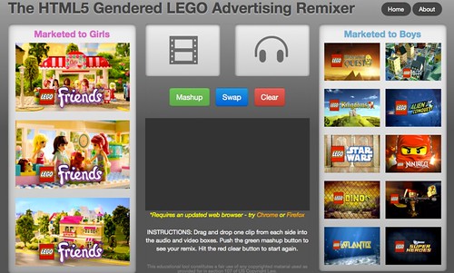
lego gender remixer
I’ve written about this site once before, but I shared it with my students as part of a larger discussion about remixing content, and (ironically enough), about stereotypes that they were discovering of Americans and Muslims as we are finishing up our critical look at Three Cups of Tea. The way I brought those two discussions together — along with a foray into companies targeting young kids with advertising — is with the HTML5 Gendered Lego Advertising Remixer.

If you have not shared this with your students, you should. It’s a great, and entertaining, way to show how audio, visual and the selling of a product to a girl or boy (as opposed to any gender kid) is done. The site allows you to mix the audio tracks from one Lego commercial targeted towards one gender with the video from the other. So you get the soundtrack to the Star Wars Lego set mixed with the video of the Lego Friends video. You should have heard the hoots of laughter from my room.

But it was serious, too, as we held a discussion about why pink is always girls, why explosions are always boys, and what happens to the kids who fall in-between those two worlds (which is mostly everyone). It was a pretty amazing discussion, and all thanks to the remixing effects of this one site.

Peace (in the remix),
Kevin