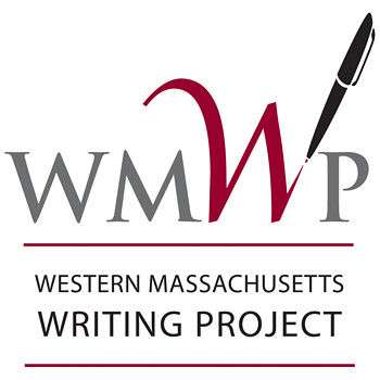
We’re moving (slowly) towards a redesign of our website for the Western Massachusetts Writing Project. We hope to be done before the end of the calendar year, and one of the projects that our site director took on was redesigning and updating our WMWP logo. For a long time, it was a gray-scale feather pen that seemed very antiquated.
So, this summer, we used a graphic consultant to come up with new designs and a few weeks, at our annual Best Practices event, we introduced the new logo to folks, who seemed to really like it. (One of the WMWP Leadership Team — it wasn’t me, honest — noted that we moved from a feather to an ink pen and maybe the next phase might be a computer mouse).
The logo and website design is part of an overall push for more inquiry into our site’s mission and how we can best put ourselves out there as a resource for teachers in the Pioneer Valley. Two years ago, we adopted a mission statement that is guiding us in all of our work:
The mission of the Western Massachusetts Writing Project, a local site of the National Writing Project, is to create a professional community where teachers and other educators feel welcomed to come together to deepen individual and collective experiences as writers and our understanding of teaching and learning in order to challenge and transform our practice. Our aim is to improve learning in our schools — urban, rural and suburban.
Professional development provided by the Western Massachusetts Writing Project values reflection and inquiry and is built on teacher knowledge, expertise, and leadership.
Central to our mission is the development of programs and opportunities that are accessible and relevant to teachers, students, and their families from diverse backgrounds, paying attention to issues of race, gender, language, class and culture and how these are linked to teaching and learning.
Peace (in the writing project work),
Kevin
Hi Kevin,
The logo is very attractive and clean, well-balanced and graphic. It has a lot going for it, and I can see why folks liked it. And your mission statement is really good.
I confess, though, that in seeing the very prominent pen at the top of the page before I scrolled down enough to read your full entry, I wondered whether this were the older one and whether I’d see a newer one below… because the very prominent pen made me wonder that. Then I read that you all went from quill to ink, so this is the newer one, but it is still true that the question crossed my mind when I first saw it.
I know, but small steps are the steps forward, right?
Most of our folks are still pen-scribblers, not keyboard-punchers.
🙂
Kevin