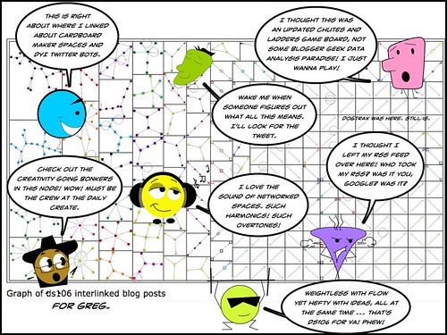
Greg kindly shared out a data visualization of some #DS106 connections.
Graph of ds106 interlinked blog posts, 9/20/2012 1:15:18 PM, 1220: https://t.co/wJs6zaAVbP
— Greg McVerry (@jgmac1106) November 1, 2018
Although I didn’t quite know what it all meant — even though the focus of the E-Lit 3.0 course that I am watching from afar is all about data tools and data analysis, so much of it is beyond me right now — Greg’s visualization looked pretty cool.
After looking at it for some time, I thought, this is a game board. Then I thought, this needs to be a comic.
So I made a comic, for Greg. The game might yet come …
Peace (in the frame),
Kevin
You have given life to some of the dots on the network analysis map.
Every othe dot on the map also is someone with a unique personality and history.