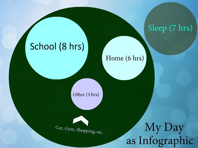
As I wrote the other day, I am curious about how to use visual infographics to tell a story. Here, as part of the #walkmyworld project, I decided to map out a typical day of mine (time spent where) and create an infographic of my day. I used an app on my iPad for the creation of it and rounded up and down a bit on the times to make them whole numbers.
I also tried to use artistic design to create the face (although I now realize the mouth is frowny because of the way the arrow points. My days are not normally frowny). The sleep element I put off to the side because it felt like that state of mind is different than the waking state of mind (and the focus was on the day). If I had more space, I might have broken down the “other” a little more in specifics.
But overall, I like how it came out, though, and the reflection points to just how much time I spend in school on a typical week day. Obviously, weekend would be different. (Maybe a different infographic).
What would your day look like?
Peace (in the data),
Kevin