I have a few favorite books that I put on my “wish list” each holiday season, and Gareth Cook’s Best American Infographics has been there since he started the collection a few years ago. Sure, we’re living in the world of Infographics now — with charts and maps and data grids everywhere you look — but there’s something about the story underneath the cream of the crop that makes this kind of curated book a joy to read.
And it is a joy. Visually, certainly, as the graphics here in Best American Graphics 2016 are wonderfully diverse and artistically rendered. But also, the short pieces that explain the rationale and the reasoning behind the visualization of the data bring to light how we can “see” the world different when we put it at another angle.
Interestingly, the opening pages to the book were a familiar sight to me – those of the postcards in the Dear Data collection, which I was in the midst of reading when I received the Infographic collection. We’re using Dear Data as inspiration for a postcard project now in the CLMOOC postcard club.
Other interesting data stories here that caught my attention here included Flowing Data’s What Americans Do All Day? (demonstrated by clusters of activity based on times of the day); Fallen.io’s Human Toll of World War II (with its devastating reality check of the impact of war); FiveThirtyEight’s How to Hack Science (which shows how skewed data can show you want you want to see); Kevin Ferguson’s The Essence of a Western (in which he distills entire movies into a single frozen frame of light and shadows); and Atlas Obscura’s Literary Road Map (literally, a map tracking routes from famous American road-trip books, like On The Road.)
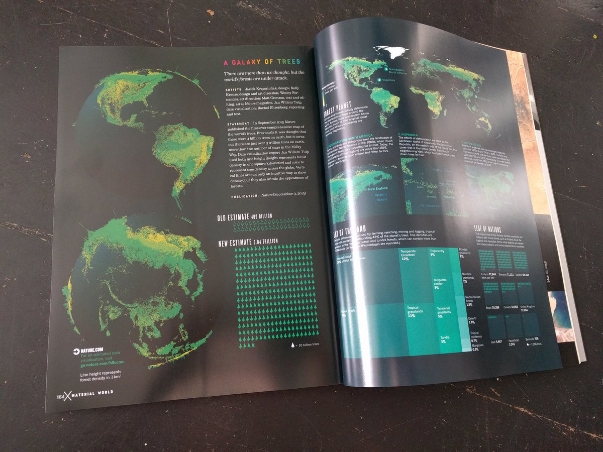
And there is the stunning A Galaxy of Trees by Nature. Wow. Three trillion trees are on earth. This map sought to show them all on a map visualization. Wow.
Some of the Infographics are online interactives, and some are just static points in time. Another interesting tidbit: the entire cover design of the book itself is an infographic, too (by designers Mark Robinson and Thomas Porostocky) so that you can unfold the cover and see an infographic wrapping up the book about infographics.
Sometimes, data can be a beautiful thing to behold. And read.
Peace (beyond data but not beyond visualization),
Kevin